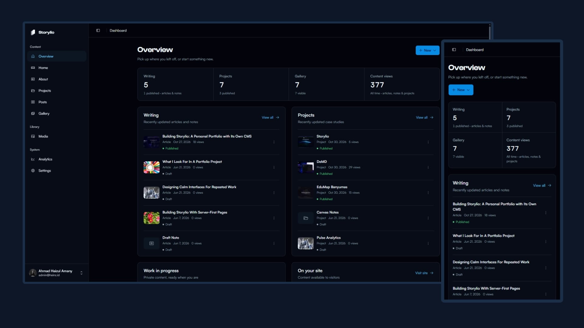
After the first version
In my first post about Storylio, I wrote about moving content updates out of the codebase and into a dashboard. Projects and articles had their own editors, images went through Cloudinary, and publishing no longer required a code change.
The next round of work involved going back through those screens and questioning the details.
At narrow widths, thumbnails and metadata left too little room for titles. Related controls had different heights. Some problems went beyond layout: a form submission could take the wrong publishing action, and a successful database update could still produce a failure message.
The dashboard already had the features. Using and reviewing them exposed the parts that needed more work.
Giving mobile layouts enough room
One of the clearest examples was the technology list in the Home editor.
On desktop, a row could comfortably hold a drag handle, logo, name, visibility information, creation date, and an action menu. On a small phone, keeping that arrangement squeezed the text into a narrow column. Technology names broke across lines, and dates occupied more vertical space than the information deserved.
Reducing the font size would have preserved the arrangement while making everything harder to read. The content needed a different arrangement.
Primary information needed room first. Secondary metadata could sit below it. Image previews did not need to keep competing with the text at every screen width.
Similar checks followed across Projects, Posts, and Gallery. Selection controls needed to align with their rows. Filters needed consistent heights. Image removal buttons needed enough contrast to remain visible over a bright photograph.
The sidebar had its own problems. A collapsed desktop sidebar and an open mobile drawer could not share every layout assumption. Changes that centered desktop icons also needed checking below the mobile breakpoint, where labels were visible again.
These were small changes individually. Together, they affected how much attention ordinary tasks required.
Making editing actions predictable
The post editor had a more consequential issue: its form-level submit behavior.
A form can submit without someone clicking its main action. An implicit submission or a descendant button without an explicit type can trigger the same handler. If that handler publishes a new post, an interaction inside the editor can make unfinished content public.
New posts now begin as drafts, and the form handler submits using the current status:
onSubmit={(event) => {
  event.preventDefault();
  void submitWithStatus(status)();
}}
Publishing a draft has a separate button action. Existing published posts can still save changes without being moved back to draft.
That distinction makes the default behavior easier to reason about. A new post stays a draft until publication is explicitly requested.
Editing also needed to account for unfinished work. In About, switching between section tabs could unmount the content form. Without draft preservation or a departure guard, returning to the tab could recreate the saved values and discard recent changes.
A Cancel button inside a form does not address every way someone can leave it. Tab changes, navigation, and reloads belong in the editing workflow too.
When the data saves but the refresh fails
One review finding in the media library was easy to miss because the database operation itself worked.
Renaming a file involved updating its record and then revalidating the media page. Both steps ran inside the main error-handling block. If the update succeeded but revalidation threw, the action returned “Failed to rename media.”
The filename had changed. The dialog said it had not.
That leaves the person using the dashboard with conflicting information. They might retry, close the dialog without knowing what happened, or assume their change was lost.
The fix separated revalidation failure from the result of the committed update:
function revalidateMedia() {
  try {
    revalidatePath("/dashboard/media");
  } catch {
    console.error(
      "Media changes saved, but media page revalidation failed",
    );
  }
}
After updating the record, the rename action calls this helper and returns the saved data. A revalidation failure still reaches the logs, but it no longer turns a completed rename into a reported failure.
The page may still need a refresh. That is a different problem from the database rejecting the change, and the response should preserve that distinction.
This became a useful question to apply elsewhere: when an action has several steps, which one actually failed, and what has already happened?
Checking changes across the dashboard
Shared components helped keep the dashboard consistent, but they also widened the effect of each adjustment.
Changing a control height could improve one filter bar and make another feel cramped. A thumbnail radius needed to make sense in both a table row and a grid card. Moving a reorder action raised the same placement question on another page.
I went through the dashboard section by section, checking those relationships instead of treating each screen as a separate design.
The checks also needed different kinds of evidence. A browser screenshot could expose a crowded row, but it could not establish whether an unauthorized reorder left the database unchanged. A regression test could verify publication behavior without showing whether a destructive button was readable over an image.
The project uses Vitest for unit and integration coverage, including isolated database fixtures. Browser checks cover interactions and responsive layouts. Each catches problems the other can miss.
What I check now
The first version answered whether I could manage the site through a dashboard. This round of work exposed the details that still made that dashboard awkward to use.
I now have more specific things to check: whether a title still has room at 320 pixels, whether leaving a tab preserves unfinished work, and whether an error message describes the operation that actually failed.
Several of those cases now have regression coverage. Visual checks still matter, especially when shared controls change and affect more than one editor.
Future changes have a clearer set of behaviors to preserve. A working save button is a starting point; the surrounding workflow still needs to make sense when someone leaves, retries, or encounters a failure.